Buenos Nachos Truck - Case study
App and Website Design
Figma/Photoshop
Project Overview
The Product:
The hottest new taco truck in NYC is putting together their mobile app to help speed up the lines and get more business.
Project Duration:
March 2024–March 2025
The Problem:
Food apps don’t always have images of the food so users know what the food looks like. Lack of delivery options in certain neighborhoods.
The Goal:
Create a product that has images of all the food. Images will help visualize what’s on the menu and make sure everyone can order from the Taco Truck. There will be a wide delivery zone.
My Role:
UX/UI Designer
Responsibilities:
User research
Brainstorming
Wireframing
Prototyping
Testing

Understanding The User
User Research: Summary
Apparently not all food apps are the same!? There is a big variance in the food apps and they don’t always address the users needs. Adding accessibility options and images will help address some of these. The delivery options should be available so that we can attract more users. This app needs to make sure that it can be used by everyone and create a need for potential users.
User Research: Pain Points
Limited Deliveries
Some people don’t have great delivery options in the neighborhood.
Fees
Some users feel that the fees that are a part of food delivery are too steep. They would be more motivated to order with the app if it was more cost-effective.
Images
Not every app has images and they are a helpful tool for most users.
Accessibility
Some users may need a screen reader or other helpful device. Their needs are not being met because it’s a constant issue.
Persona: Anastasia Fedorov
Problem statement:
Anastasia is a person that likes to try new food options who needs Images of the food, so that she knows what the food looks like, she really likes to try new things, but wants to see what she’s getting herself into.


User journey map
Goal:
Anastasia wants to be able to use more food apps with pictures of the food items.
Starting the App design
Paper wireframes
We wanted to create an easy but interacting design that engaged the user and created a flow that was easy to place an order. We wanted the app to have some extra features that made the ordering process a pleasure to do!


Digital wireframes
We want the home screen to present some options that will capture the user’s attention. This will hopefully create excitement and captivate their interest in the items that we have to offer.


Low Fidelity Prototype
We want the user flow to be easy and straightforward. The design allows the users to easily find the items that they’re looking for, add them to the bag and checkout quickly.
You can view the prototype here.

Usability study: findings
We analyzed the data that we got from our focus group and needed to put it in order so we know what is working what needs to be addressed.
Round 2 findings
The “add to bag” section needs improvements.
The address/payment section needs improvement.
Round 1 findings
The place to enter the address was difficult to find for most participants.
Most participants felt that the phrasing of the bag and checkout needs work.
Some participants wanted to see a status page after placing the order
Refining the design
The design system
The design system consisted of a red, white and green color scheme to represent the Mexican flag. The typefaces, buttons and overall design was simple and fun.

Mockups


Accessibility considerations
The main colors of the branding are red and green for the Mexican flag. That’s a problem for some users that may be color blind.
We used the colors in a way that they would be high contrast with the text in a different color to ensure legibility..
This was tested by some users who had trouble telling red and green colors and it was successful!! The high contrast design allowed for differentiation of colors.
Adapting the design for the website
Site Map
The site map helped to design the web version of the app. It broke down all of the links that we had planned and made sure that the navigation was as easy and straight-forward as the app is.


Design System
The design system consisted of a red, white and green color scheme to represent the Mexican flag. The theme was adapted for a website and sized appropriately. Some of the buttons had to change, but very minimally.

Digital wireframes (Desktop)
We created digital versions of the wireframes and were able to put together a LoFi prototype.
View LoFi Prototype


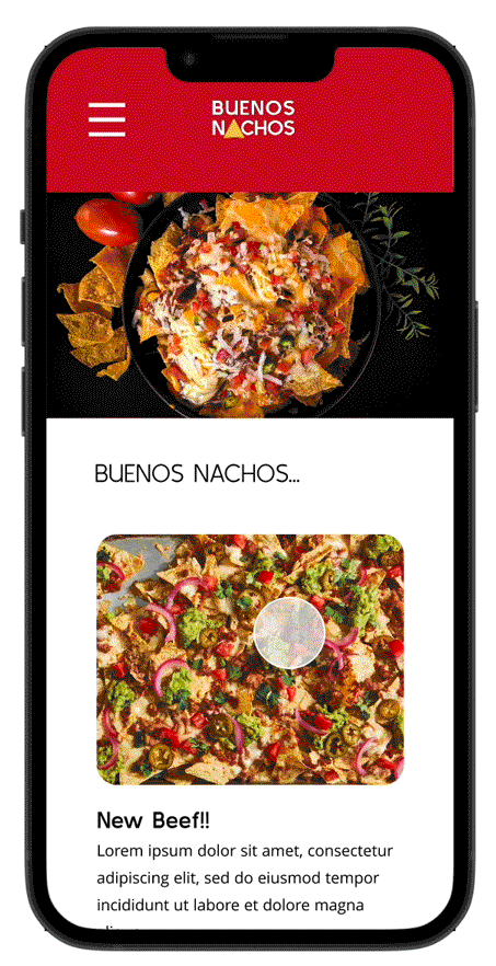
Mockups (Desktop)
After the design was created for the app, we were able to change some of the functions to reflect the website’s layout. This allowed us some more space to spread our wings. The menu section really opened up with a carousel for tortilla chip selection and a real-time toppings screen to allow you to see what you’ve added to your chips!


Hi Fidelity Prototype (Desktop)

Web Design (Mobile)
We had to make sure that the site was set up for responsive design. We can have it optimized for mobile, tablet and any other sizes that a user may have, so this design needed to be transformed into multiple versions. We began with mobile design to ensure that the website would work in a vertical setup.